Most Recent: When Zagan Falls – A Mythic Bastionland Realm
This Mythic Bastionland setting supplement features a homebrew campaign setting I played with my friends with art history inspiration, as well as games like Dark Souls, Elden Ring, Steve Jackson’s Sorcery! and shows like Record of Lodoss War! I didn’t have much time to put it together in time for the Jam, so it will be an ongoing project. I plan to add more layout, editing, and art too! It was a blast to illustrate, design, and write a module for such an inspiring system! For use with the incredible Mythic Bastionland by Chris McDowall!
For the full thing, take a look at it on itch.io, where I submitted it for a fan content contest.
Arcus Zagan II was the Emperor of the Holy Zaganite Empire. When he falls in battle, so too will his kingdom. His last effort as Emperor was to launch three mighty arrows in different directions. Where each Flèche (arrow) landed, a hold blossomed. And so, every few years, one of the three holds – The Three Seats of Flèche – compete to become the Seat of Power, with Zagan’s acolytes relaying their choice from the weakened king up on his mountaintop castle.
The goal is to add more unique mechanics to places you can go, like the treacherous ever-cloudy mountains of Karkanosze, which has unique rolls you make for each fog tile you cross through, or the Fogfen, which you adapt to once you meet a seer. The main content right now is the Realm map (pre-labeled and un-labeled!) the mountains and stronghold of the Emperor Zagan, which includes a site map for his fortress – the Flèche Nock. There are seeds of adventure included, as well as interactions between where some of the landmarks are placed, and the Myths I randomly rolled from the base Mythic Bastionland book and re-written in context to the Realm. Of course, the integration is open-ended enough for you to re-use the map for any myths to see how they interact with the setting itself! This will be an ongoing project that I intend to add more stats/ art / design to / edit and test as time permits.
Design Manifesto Booklet – A Terrible Purpose
For Design Thesis Research, before I began on my TTRPG book, part of the research was creating a manifesto to define our unique values as designers. For mine, I liked the quote from Frank Herbert’s Dune, involving the realization from Paul Atreides that he had been “infected with terrible purpose.” I thought such a way of phrasing it really spoke to the idea of destroying the established expectations of design, and instead paving the way forwards with all new ideas.
The result was some graphic and layout design presented in a short booklet of my ideas, with primarily typographic and simplistic design as the core for its identity. Each page is a digital 2-page spread, but I wanted it to still function if it were printed as a small magazine.


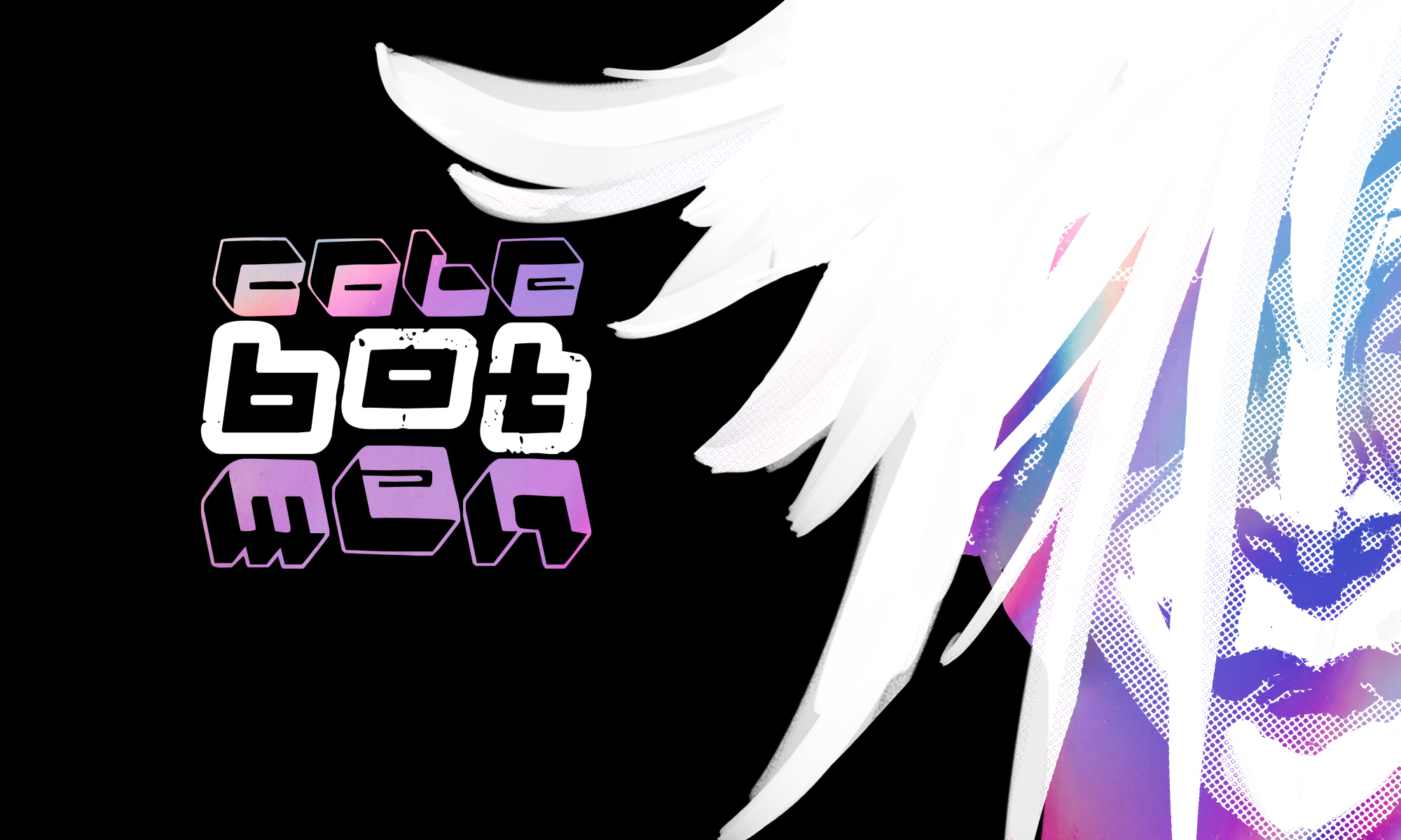
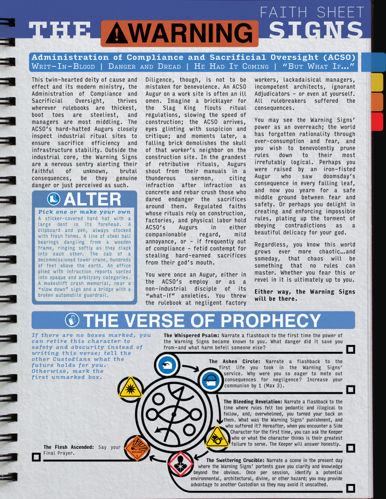
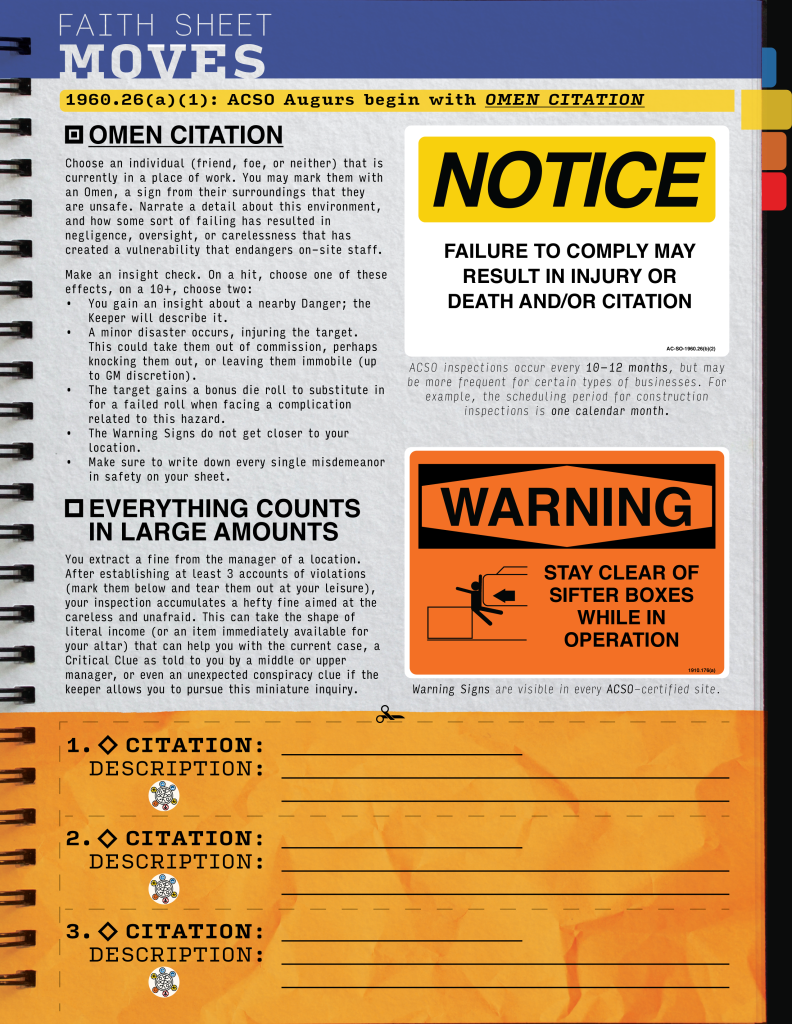
Silt Verses TTRPG Custom Faith Sheet Design – The Warning Signs
The Silt Verses is a podcast about a world with horrific divine entities that feed on humans, symbolic of capitalism. Likewise, the tabletop-roleplaying game is steeped heavily in commentary about corporate machinations that turn normal workers into cogs within a greater machine, all with the purpose of gaining sacrifices. In the game, classes are instead defined by “Faiths,” each providing a Custodian (player) a glimpse into what worshipping one of these corporate (or illegal) gods can bring.
For my own homebrewed Faith sheet design, I decided to riff on iconic OSHA safety symbols, working with my Warden (GM) Toby Tegrotenhuis, to write a setting-appropriate introduction to the Faith. In the end, I helped game design and write the core “moves” (class features), and put the whole thing into an employee-official looking booklet (instead of a typical TTRPG sheet) that looks just like we imagined it would in-universe.
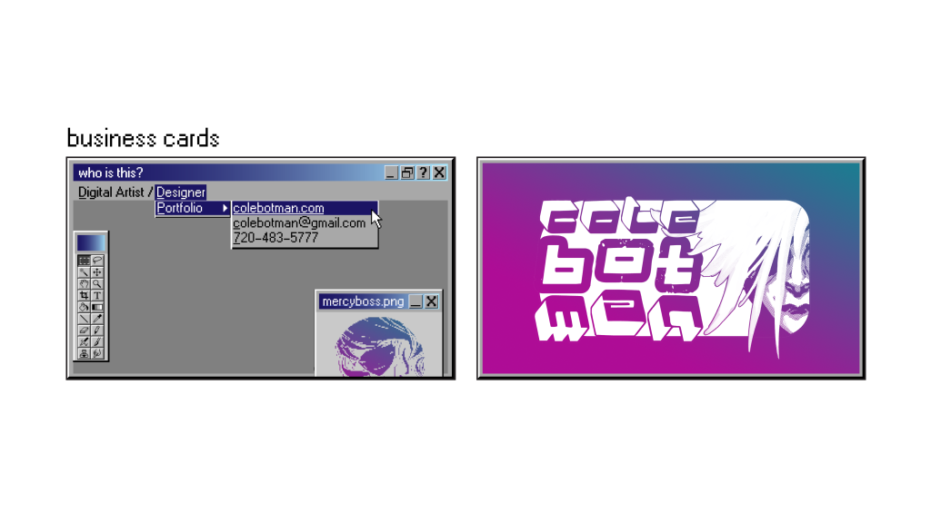
Design Campaign – Self Branding Project
After going through many iterations, I finally settled on creating assets to better market myself. I leaned into my favorite mid-2000’s early internet aesthetic with a gradient and white, as well as business cards designed to emulate the look of Windows 95 visuals. I went to create my own style guide and color scheme to assure all elements stay visually comprehensive.
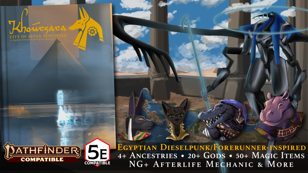
Most Recent – Akh in the Shell (Khoursara)
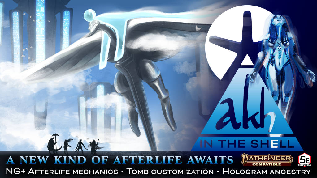
Akh in the Shell is a modular set of rules for integrating the Egyptian Afterlife into your D&D 5e / PF2e game, with optional rules for a Ghost in the Shell inspired science/fantasy holographic technological twist. I wrote, designed, and illustrated the whole thing, with some help from my partner. This is the first section we are crowdfunding for our D&D setting book, Khoursara, City of Seven. Akh in the Shell acts as the first section, which focuses on the scifi-fantasy elements of the world setting.
We just got funded! Come check it out here!
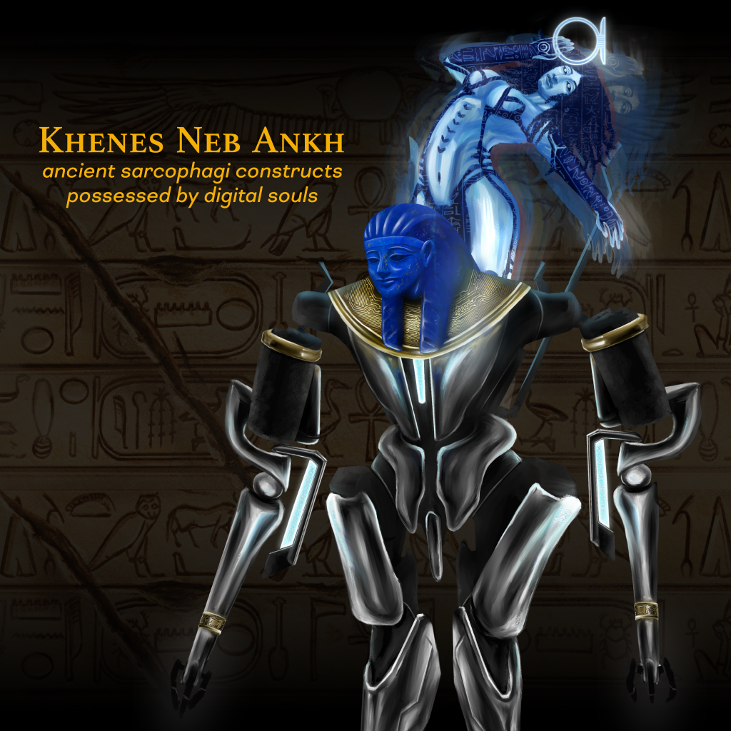
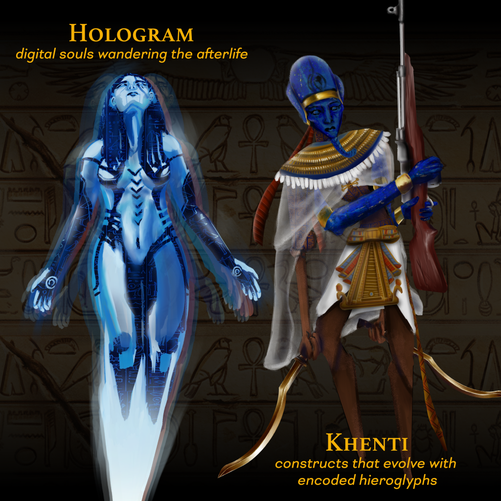
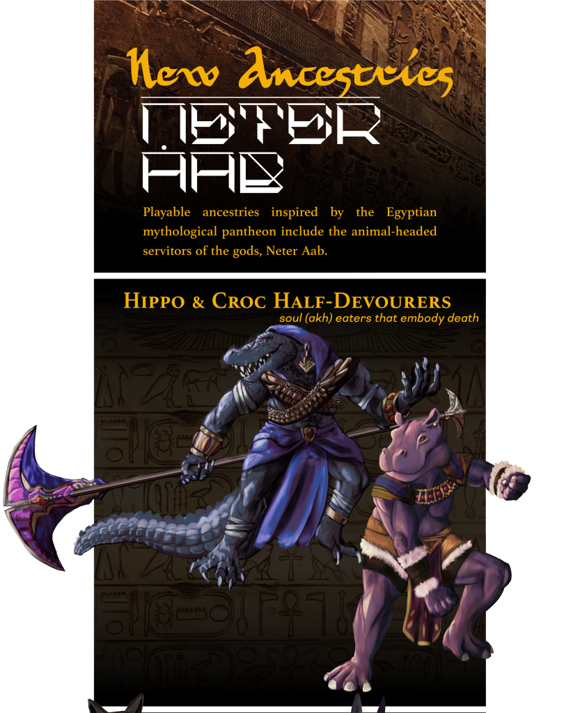
Inside, there are new playable ancestries for your D&D 5e / PF2e game: Khenes Neb Ankh (mechanical sarcophagus constructs possessed by digital souls), Holograms (digital souls), evolving constructs (khenti), and more playable ancestries inspired by Egyptian gods.
A new starter adventure awaits across the great deshrets of Hakibad and beyond! Escort the Pharaoh’s mysterious Chief Lector Priest across deserts of red, gold, and black, towards the megalopolis city of Khoursara where civil conflict among the Noble houses is about to break out.
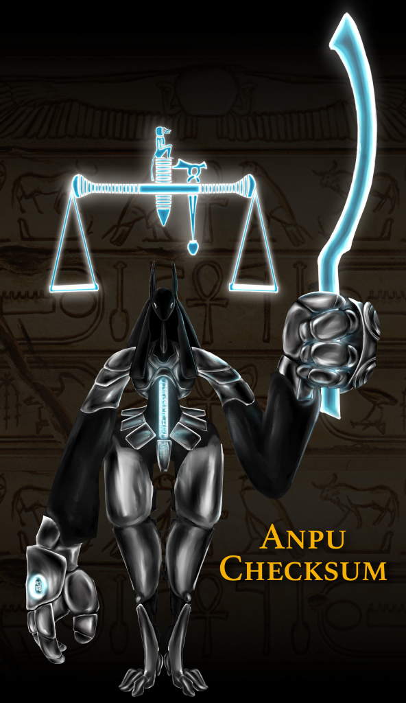
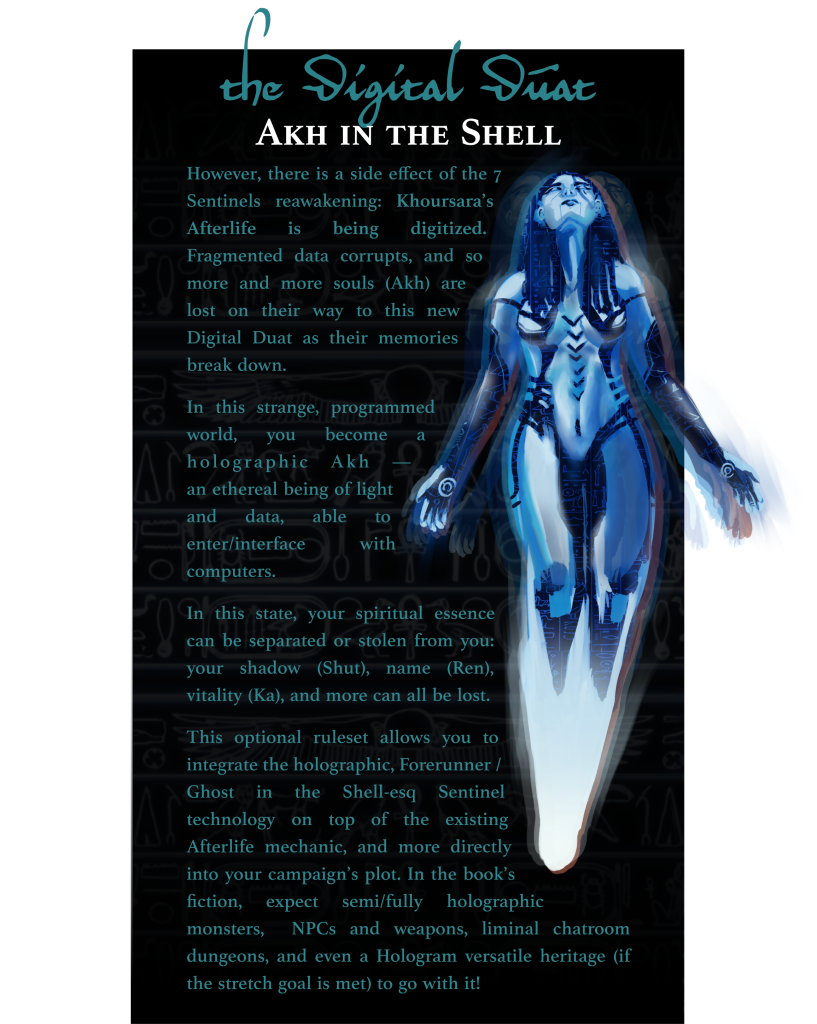
Within the Sentinels are derelict divine machines upholding the very code base of the Afterlife itself from the outside. These mechanical monitors perform a range of tasks, from basic terminal operation to vital soul-weighing ceremonies of the recently deceased for the continuation of the digitizing Afterlife.
Anpu Checksum, Canopic Guardians, Ibis Monitors, and more feature in this book as fearsome mechanical / holographic creatures for your party of heroes to take on in the Digital Duat!
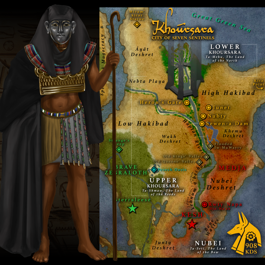
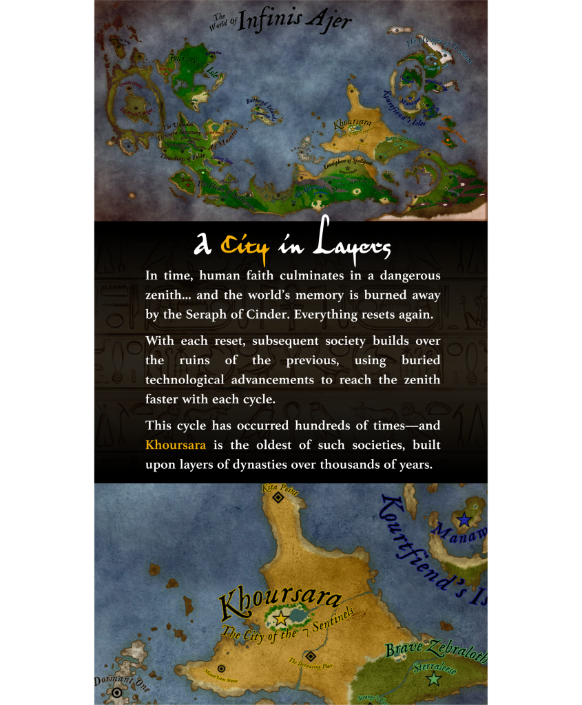
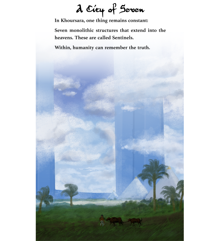
Khoursara: The City of Seven Sentinels
Each section of the Khoursara book (like Akh in the Shell) will exist as standalone pieces that you can get each on their own in PDF format, and eventually they will be combined into a full setting book (see below)!

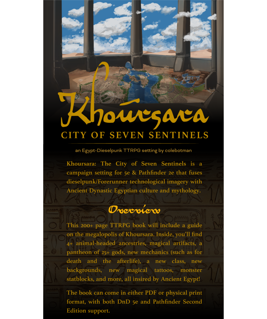

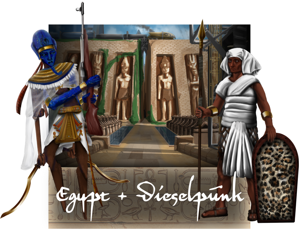
Using Kickstarter, I want to publish a D&D TTRPG setting book that allows players to interact with the high-fantasy dieselpunk megacity I’ve written, inspired by ancient Egyptian mythology and Halo / Ghost in the Shell imagery. The writing and game design derive from the art history courses taken over the length of my college career, which influenced me to read even more on cultural inspirations for game mechanics. I wanted to blend the pantheon, afterlife, and cultural traditions of the Predynastic, Old, and New Kingdoms of ancient Egypt with present-day Egyptian-Arabic speaking Cairo. I applied this not only to the setting and story of the world, but in the design of the book’s layout as well, such as in this style guide that informed the rest of the project.
A city within the world of Infinis Ajer, Khoursara, the City of Seven Sentinels is one of the oldest cycling cities in the world. The “Sentinels” are towering spires that climb into the heavens surrounding the city’s walls. The megalopolis city is made up of numerous districts, each the size of New York city. As of 908 KDS (Kynd Set Date), Pharaoh Pyrrhic Adaephonus rules over Khoursara, and his 7 Nobles and their houses oversee aspects of day to day life.

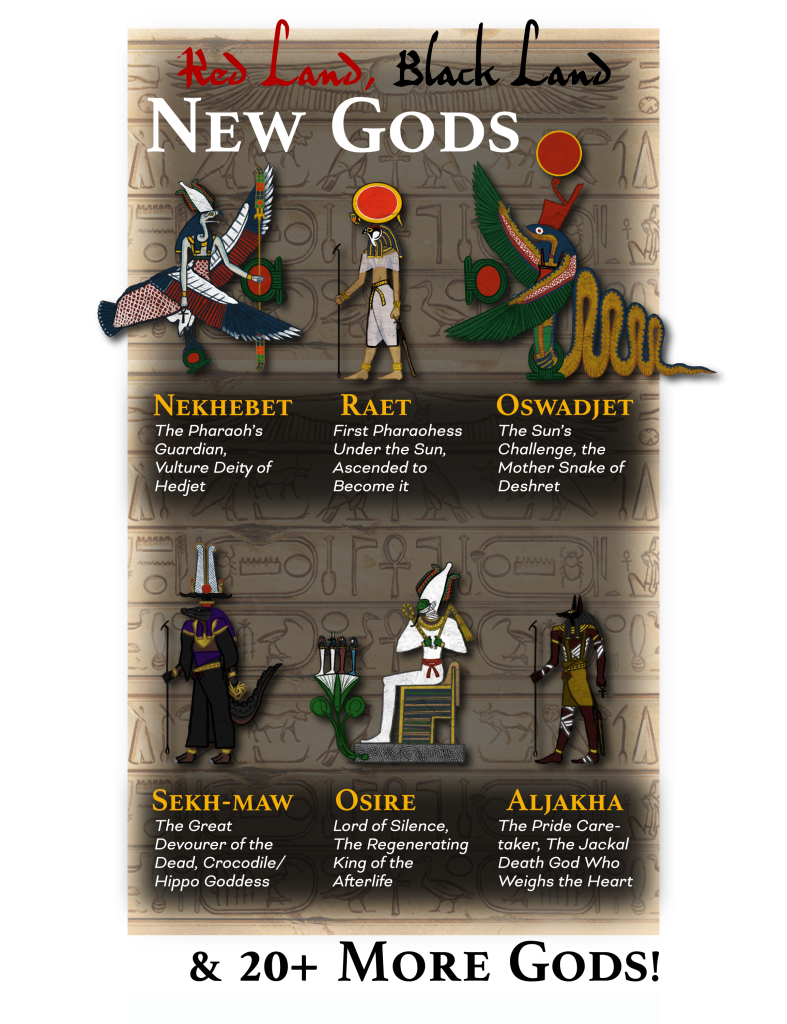
Inside the city of Khoursara, you can play / meet many different ancestries and creatures, all of which are meant to reflect the Egypt-inspired animal-headed gods. A core part of the book will focus on these new ancestries, with numerous suitably divine thematic feats for each, influenced by the Gods of the setting itself.
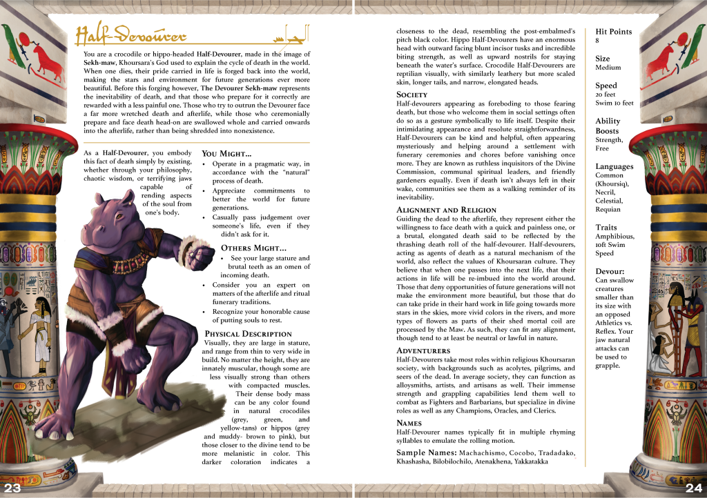
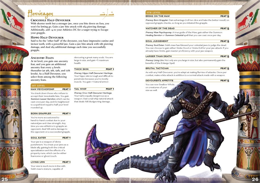
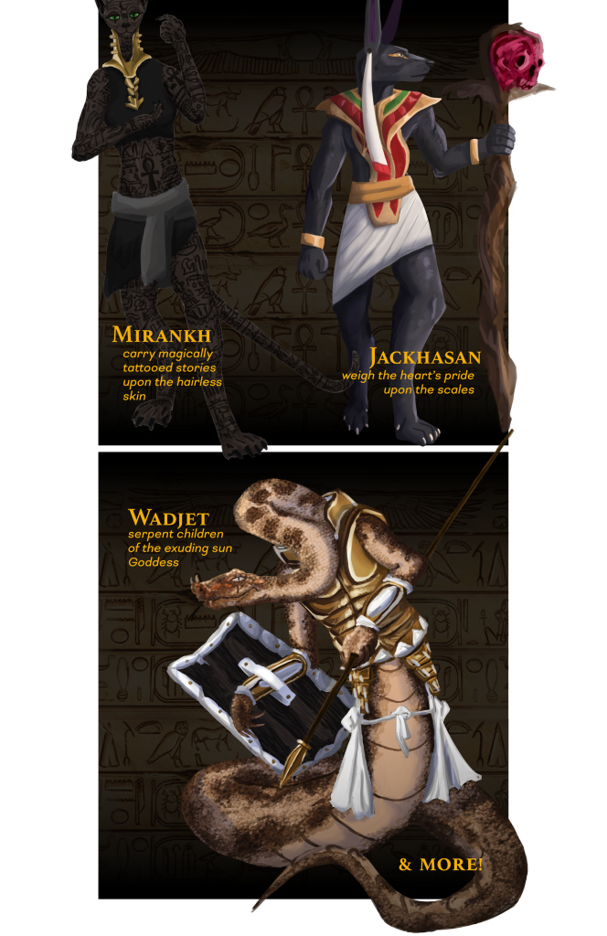
For instance, Half-devourers are crocodile and hippo-headed humanoids that trace themselves back to the Goddess, Sekh-maw the Great Devourer. They’re able to rend the Ka (the aspect of the soul that makes us alive) from the body of those judged as unworthy. Hairless sphynx cat Mirankh embody a Goddess who was split into two parts, her eyes of truth and her body of knowledge – Miram and Kita. They tattoo their life stories onto themselves, carrying on and becoming empowered by their family’s traditions and tales. There are many more playable ancestries planned for the full book, such as jackal-headed Jackhasans, snake-headed Oserpenti, and more. I commissioned Mingi Webber (@Sinner_Minner) to help me with the Half-devourer and Jackhasan art, making the rest of the book’s art myself.
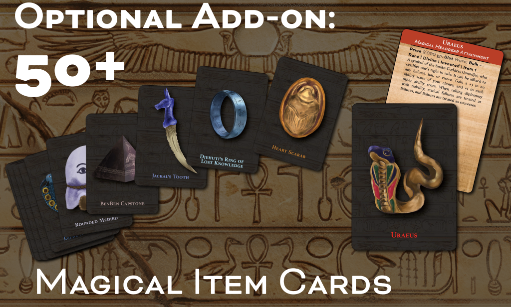
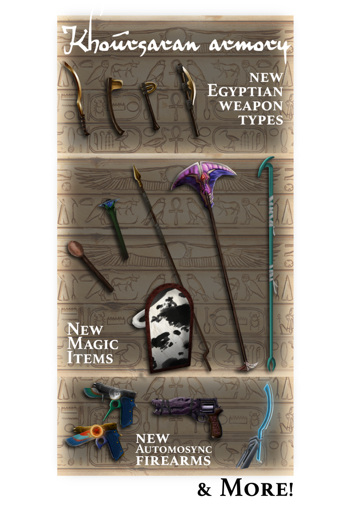
An additional 50 items, illustrated by Mingi Webber (who also drew some monsters and ancestries), will also be included, which you’ll be able to get on cards with their mechanics I designed on the flip side as an optional add-on.
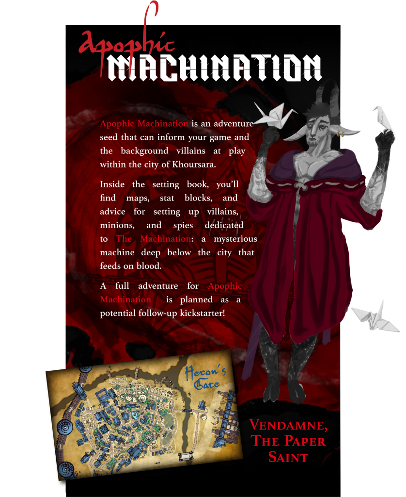
Additional rules in the book will include The Duat (or Afterlife) which will function like a New Game+ that you’d see in video games, where when one dies, preparations made for the afterlife will impact the kind of game you can play in the world afterwards. Optional rulesets lean into the Halo and Ghost in the Shell inspirations more, in that The Duat is becoming digitized, and as such, those who pass into the afterlife have their soul / Akh (and other parts of the perceived Egpyptian soul that make up it) corrupted, distorted, and lost.
This means players can opt to become holographic in nature (with the Hologram archetype), or upload their consciousness into a shell, like with the new Khenti ancestry (shown below with the Shabti heritage).
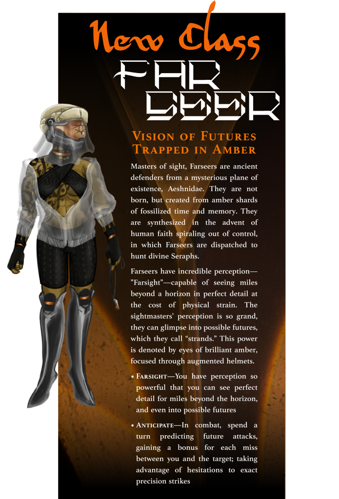
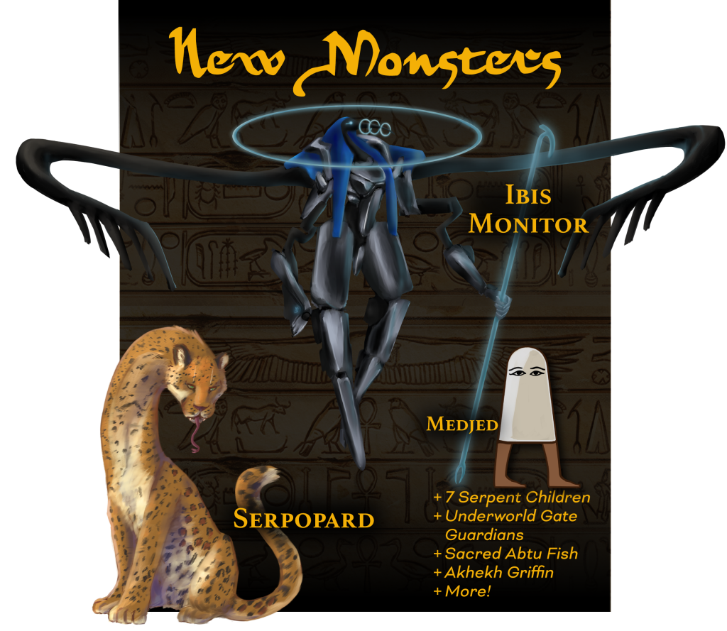
Other mechanics will include a new class – the Farseer, new monsters, new archetypes (such as the aforementioned Hologram), new Cleric / Champion Gods and faiths, and numerous items, all themed around Egyptian mythology and art history.
Part of the design thesis was establishing a style guide and laying the groundwork for what the project was aiming for. Another part of my ethos was integrating the thematic component of cycles into the title of the setting itself symbolic of the fused past and present.


Nonprofit – CU Denver Music & Entertainment Industry Studies Brand Redesign
Design Lead for Nonprofit MEIS Rebranding Campaign
In Professor Lynn Mandziuk’s Design Studio III class, I was team lead for a project with nonprofit CU Denver’s Music & Entertainment Industry Studies (MEIS) department to create a new secondary logo, website animations, department icons, poster/slide prefab assets, and more all to improve public interactivity. I worked on the logo itself, the slide and poster prefabs, and the web background designs, as well as maintaining contact with Alice Crogan (Director of Marketing & Communications at CU Denver) and the fields of study in MEIS’s department.


VIRGIL is a short animated sequence in which I practiced my ability to animate motion graphics and tracked designs using footage from the game Halo 3: ODST from Bungie software. The game is a very mystery-noire oriented aesthetic, with rain pouring down in an alien-invaded city. As such, treatment of my applied motion graphics mostly revolved around conveying the futuristic focus on keeping track of important data, all in the form of the game’s AI character, VIRGIL (the city’s Superintendent).
Tabletop App Development – Oblex
Another project was from my UX/UI Class, in which we could attempt to mockup and program an app that would solve a niche, particular problem. I wanted to create one that could bring the instant messaging of Discord (or other social media) alongside the tools Game Masters could use to run their tabletop games or board games live for their friends. My resulting project was “Oblex,” where I mainly focused on designing the interactions with every single button and page to allow for gameboard movement while typing commands to roll dice, much like a Discord automated bot would do. My other focus was to bring livestreaming even to mobile, to enable games recorded or streamed to an audience on the go from any device.
A link to the app mockup can be found here.

Self-Employment – Colgi Minis, a Miniature 3D Printing Company
Another huge part of my life has been taking this tabletop hobby into a business I founded in 2021 with my partner in life, Min. We originally 3D printed models for D&D and board games on our UV resin printer, and one day decided to try things marketing them online. It took off in ways I couldn’t have ever imagined, and eventually we intend to market not just the licensed models from commissioned artists, but our own sculpts as well. I designed and built the framework for our marketing, including social media presence, thumbnail design, stickers, miniature photography editing, running seasonal sales, and uploading hundreds of unique listings.

Colgi Miniatures can be found here on our Etsy page!
We’re in the middle of designing our own site away from Etsy as well, which I created a mockup for in my Design Studio II Class.
Another marketing campaign project in class was to create a memorable brand using only a very basic and recognizable insignificant object. I chose a screw because on its own it has little use. I ended up inventing a strong-sounding brand I named “BASTION,” in order to elevate it as a beacon of light in the dark. People might see screws as boring, but I wanted them to be perceived as vital to disaster rebuilding efforts, or keeping homes safe during natural disasters. The project called for full hi-fi logos and UI, mockup renders, and usability consideration.


Graphic Design in Economics of Healthcare: A Brief Introduction by Andrew Friedson
I worked for Andrew Friedson, Ph.D, Associate Professor and Director of Graduate Studies at CU Denver’s Health Economics department to create visual aids and graphs for his publication involving the accessibility of healthcare to the working class, Economics of Healthcare: A Brief Introduction.


Worlds Logotype is a short video I animated to represent emblem of my identity and online presence as colebotman. The music used is j^p^n’s Scarce, and through use of Adobe After Effects, I was able to time each vectored shape to the music itself.
The Typeface Assignment from my freshman year was a project in which I was able to create a title typeface for my comic, inspired by the visual themes from it. It was interesting to work with repeated modular elements, such as in the lowercase especially was the circle-dot eye or set of triangular pupil to symbolize the strange, always-being-watched tone, while still being a modern sans-serif.


The Essence Project during my second semester of my freshman year allowed us to explore design in terms of feeling and visual portrayal of a broad concept. For mine, I decided to go with the essence of Memory. The word to me spoke of thousands of years of human evolution, falling short only in one respect: The ability to clearly pass down memories and experiences of life. While information can be written and cataloged, what makes each individual truly unique is lost to time.
Thus, I was really inspired by the incredible 1995 animated film Ghost in the Shell for inspiration on portraying the idea of the human form being merely a shell to carry our legacy within. I went with a robed female character concept in grays and blues, to look porcelain, mechanical, cracked with time and only a fragment of the pieces that are lost overtime, with broken contrasting yellow typography to emphasize mending the old into the new.

The Charon Sheet is a project I worked on that was a challenge in subverting the expectations of the customer’s anticipated view of a Dungeons & Dragons product. I have always been a huge fan of D&D and Pathfinder, but found that introducing the game and creating characters involved a lot of information and organization that isn’t apparent immediately when you purchase the starter versions of the games. So, I went with a more updated and modern look – turning the character sheet into a book that could store all of your information, while having a simple and fun design that pays homage to mimics, which are creatures that disguise as objects to trick unsuspecting adventurers. With this, I went for a simplistic box, and a hand-stitched, silly looking two-sided clasp that would serve as a closed eye as the book is closed, and a tongue when opened to show the mouth where the pages would go.


Typographical Exploration – Lulu
For my Typography class, one of the assignments was to characterize a quote with visuals. I personally enjoy wedding design with drawing, so I figured I could take a quote from Jhin in League of Legends, and create a new character based on the quote alone. For the typography design, I made three solutions, ranging from safer, less visually overloading options, to a full character design alongside the quote. The character is a tactical jester named Lulu, who is inspired by the real-world first roman clown.


Brand Package Redesign – Death Stranding Special Edition
For this project, we were supposed to create a Brand Redesign for a product we were familiar or interested in. I went with one of my favorite recent games, Death Stranding. This is a new game by the infamous Hideo Kojima, and is recognized for its weird flair and bizarre plot inlaid with heavy metaphors and symbolism. The core of the game’s mechanics are to transport heavy cargo from one place to another, mostly on foot, establishing the game’s theme of connections in a destroyed world. For this design, I went for a new version of the game’s special edition. I went for a sliding metallic container look, wrapped in the game’s recognizable ‘void-if-tampered-tape.’ I vectored the sheen of the metal based on a texture I created in real life, and wanted to wrap the tape and branded ‘Bridges’ emblem around the box as realistically as possible using my digital tools.


The Varia Emergency Survival Kit was a project in which I could take an existing brand or design, and repackage it with a new line within the brand itself. For this, I took one of my favorite game series of all time (Metroid) and created the concept for a ‘grab-and-go’ case with a special edition Nintendo Switch console, themed around the typical red and white medical red cross, and an emblem of Samus’s helmet, with orange as a secondary color.


Farsight EXPO was a project in which we could create an Adobe design conference with a theme, and proceed to do all of the marketing, such as collateral, digital, and print work that would be used at a large convention, housing thousands and thousands of people. The design challenge here was to make a simple enough set of pieces that could be rearranged into many different mediums – from pens, postcards, and other paraphernalia that can be small and detailed, to large banners that must be legible from the street or from the grounds below.


Group Project – Spin Magazine
For this Typography 2 class project, we grouped up to make a music magazine design, which we broke up into quadrants and colors based on the bands. I did some two-page spread layouts, and I was responsible for the footer design, front cover, and main logotype.


Wall Art Installation Mockup – Eyes of the Beheld
Eyes of the Beheld was a project I made for my freshman year. I purposefully wanted to integrate an illustration overlaid on a QR code. Getting this to work functionally as well as portray my message (of drawing viewers deeper into the world without words) effectively was difficult, but was an interesting and great way to practice hierarchy, layering, and framing. Another element of the project was mocking it up digitally in a real-world setting.


Ongoing – D&D World Setting

I decided to write my own world setting for the game on a gigantic scale. The core premise of the world of Infinis Ajer is that it is fueled particularly by human faith. What human cultures believe is in turn made reality. Thus, societal concepts, like gods, religions, or the imagined way the world should work all rapidly change at the hands of humanity’s collective belief in their surroundings. It’s an idea I thought of while exploring art history and the vivid worlds imagined by completely different cultures for the same concepts.
Another result of this faith is that Infinis Ajer has restarted itself over completely from memory hundreds of times each time this faith reaches a boiling point and creates problems – such as The Seraph of Cinder – unbound by Gods and controlled fully by people. This Seraph nearly ends the world each generation, but is instead slain in a particular way, sparing life as we know it and instead burning away the collective memory of the entire world. While the physical artifacts and ruins of previous societies still exist, the ancestries of the world forget everything and start over from the stone age, gradually building layer after layer over previous cities, adapting their technology, customs, and culture as their own.
To begin, I made a deck of cards both for use with the game setting as well as set in the universe itself, as if you could purchase such cards from a Khoursaran merchant.


Another project within my D&D setting and in Khoursara, “MIDRA,” saw my first foray into 3D animation. Wanting to continue on my writing specifically into Khoursara further, I decided to recreate a setting with some fog, megalithic structures, and a bit of eldritch horror suspended in the ancient technology. I was inspired by Kid A by Radiohead, and more specifically the song from that album, Everything in Its Right Place. That song gave me the direction to tackle the vastness of the Sentinels surrounding the city of Khoursara, and what lie within their unfathomably huge spires.
In the Denver Pop Culture Con Website, I designed a website concept in HTML and CSS for the Denver Popular Culture Convention (formerly known as Denver Comic-Con). I learned much about the organization of websites, including adaptive and responsive interfacing, legibility of different menus, and how to design something that will be interacted with by presumably a large variety of people who may attend. Additionally, I created a poster design and animated gif that would play as an ad in an online space.

Tabletop Event Design – WizCon
Another project I had for my second design studio class was to alter an existing event and propose, with research, how to improve or rework it. My choice was the already existing conventions within the tabletop gaming hobby for games like D&D, Magic: The Gathering, and more card board games, but with a focus on representation for marginalized communities that are often excluded from feeling like part of the community. My proposal took the shape of what I called “WizCon,” which not only could celebrate the long life Wizards of the Coast has breathed into this hobby of ours, but also as a step in the right direction towards representing their full community. Part of the brief involved infographics, as well as a hypothetical floor plan and schedule for the convention, complete with panels and speakers.

Older Work – Webcomic: HYPNOGOGIA

These pieces are all apart of a current project of mine: A webcomic titled Hypnogogia, which is written, drawn, and conceptualized by me. The setting of the science fiction story is an alternate reality to our own, on a planet called Hiraeth. With a world so connected and progressive, such technology easily fell into the wrong hands – setting the stage for a society ruled by force-fed simulated dreams.

2 + 2 = 5 is another part of the story, acting as a poster and landscape of one of the locations within the story.

The Narrative is another element of the world of my story is a magical book which crashed down on Hiraeth in ancient times. This book explained a key element of how the universe worked, leading to rapid progression for humanity in this timeline. This book, seemingly coming from space itself, was dubbed simply as “The Narrative,” and is said to grant its user both the knowledge and ability to alter the fabric of reality itself: a reality which they realize was made up entirely of microscopic butterflies. I created a physical version of The Narrative for an IB (International Baccalaureate) Art project, along with many other pieces detailed below that feature characters from the story.


Ambo-Membrum Inferius Schematic was an IB Art project intended to begin introducing one of the main characters, Mercyboss into the art surrounding my story. Using the idea of medical blueprints for prosthetic limbs, I wanted to create story ques to lead any keen-eyed readers further with characters in the story, as well as continue the tone of cyber-retro-futuristic punk design. The overall ideas for pieces such as these are to be singular pieces of information that give few clues and keep viewers guessing and drawing more information as they find more artifacts like this blueprint for what is happening.

Hiraeth, The World You Never Knew was my pretend documentary set in my world functioning as a warning and expositional piece. The villain in the story, Petrichor took all of the issues with humanity and silenced them by forcing everyone into a constant state of dreaming. If the populace sees exactly what they want to see, they do not complain of the censorship of our valuable historical lessons of our history. The voice acting done by myself, editing, work, and sources cut into the final piece, inspired by John Carpenter’s ‘They Live,’ and George Orwell’s ‘1984.’
A Map of the World of Hiraeth. This began as a hand-drawn concept, then was scanned, then digitally reproduced so that I could use it for further storytelling purposes for Hypnogogia.

Local Community & School – Graphic Design Projects
During my Junior and Senior years at Centaurus High School I designed several CSQUAD Poster Designs for the school’s event organizing team, CSQUAD. These had a color scheme matching the school’s red and blue mascot. Each one was for a specific purpose, with requirements in mind of the tone. The CSQUAD Personnel Meeting poster, for example, had to portray a lot of information, yet still be able to catch the viewers eye. Cramfest was much more of a homemade feeling to tie into the calm and enticing event before finals week.


This poster design was to support La Raza, which is a Denver based organization that advocates and raises money and promotes youth leadership especially in poverty-stricken Latino communities, as well as advocating for culturally responsive human services to all Colorado communities in need.
For more information, visit: http://serviciosdelaraza.org/
MarchFourth is a band I made a poster design for in the summer of 2015 for a contest. My inspiration for the poster was to portray the band’s motto; ‘This band is your band,’ visually. Thus, I considered heavily on Russian-era propaganda, as well as American recruitment posters for inspiration given the ‘sharing community’ and overall red color the band is recognized for. The poster won second place from a class vote, but when the band members went to see them they chose mine instead for first place.
